Prime Roots Packaging
Role
Art Director
Graphic Designer
Work
Art direction
Packaging
Client
Prime Roots
Prime Roots is an all-new food brand that looking to change the meat industry by focusing on fermentation science and the use of various fungi to create “superprotein” bases for vegan products such as chicken tenders, bacon, lobster, tuna chunks, crab cakes, and salmon. They are on a mission to create new sustainable protein sources that appeal to meat lovers, vegetarians, and vegans alike.
Color is a crucial element in creating a strong brand. It can conjure a stronger emotional response and cultivate a connection with our customers. Moreover, using this color palette will ensure consistency
in Prime Roots communications. So for the new Prime Roots brand/packaging, it has four primary colors: Delicious orange, fun yellow, passionate red and natural blue. Both orange and yellow are bright, which bring out the playfulness and creativity of the brand. The darker red and blue, on the other hand, provides a mature impression.
Featured in DesignRush

Prime Roots’ Box
Prime Roots is a brand that delivers delicious alternatives to meat as a lifestyle choice. We are our customers and we create our products and experiences the way we would want a responsible food brand to be. We’re a community. We’re building much more than our amazing products, we’re building experiences and connections to food.


Prime Roots’ Packaging
We ask the community what they want since our technology platform lets us rapidly prototype more products than we can release.
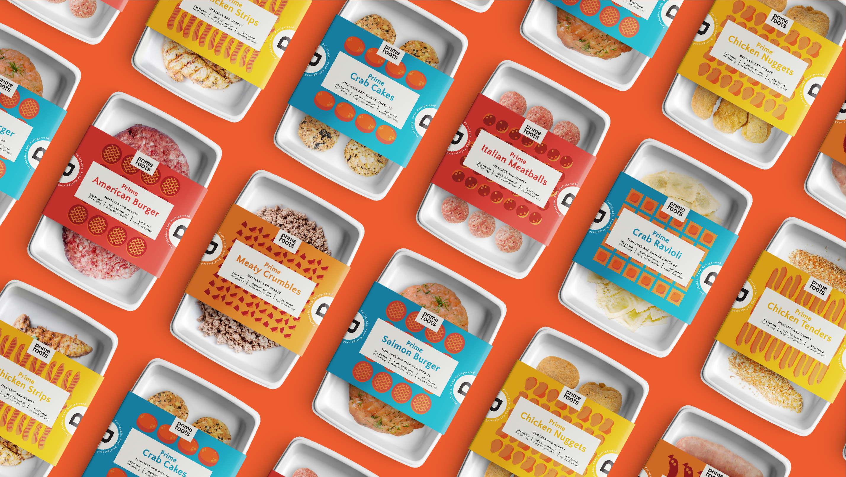
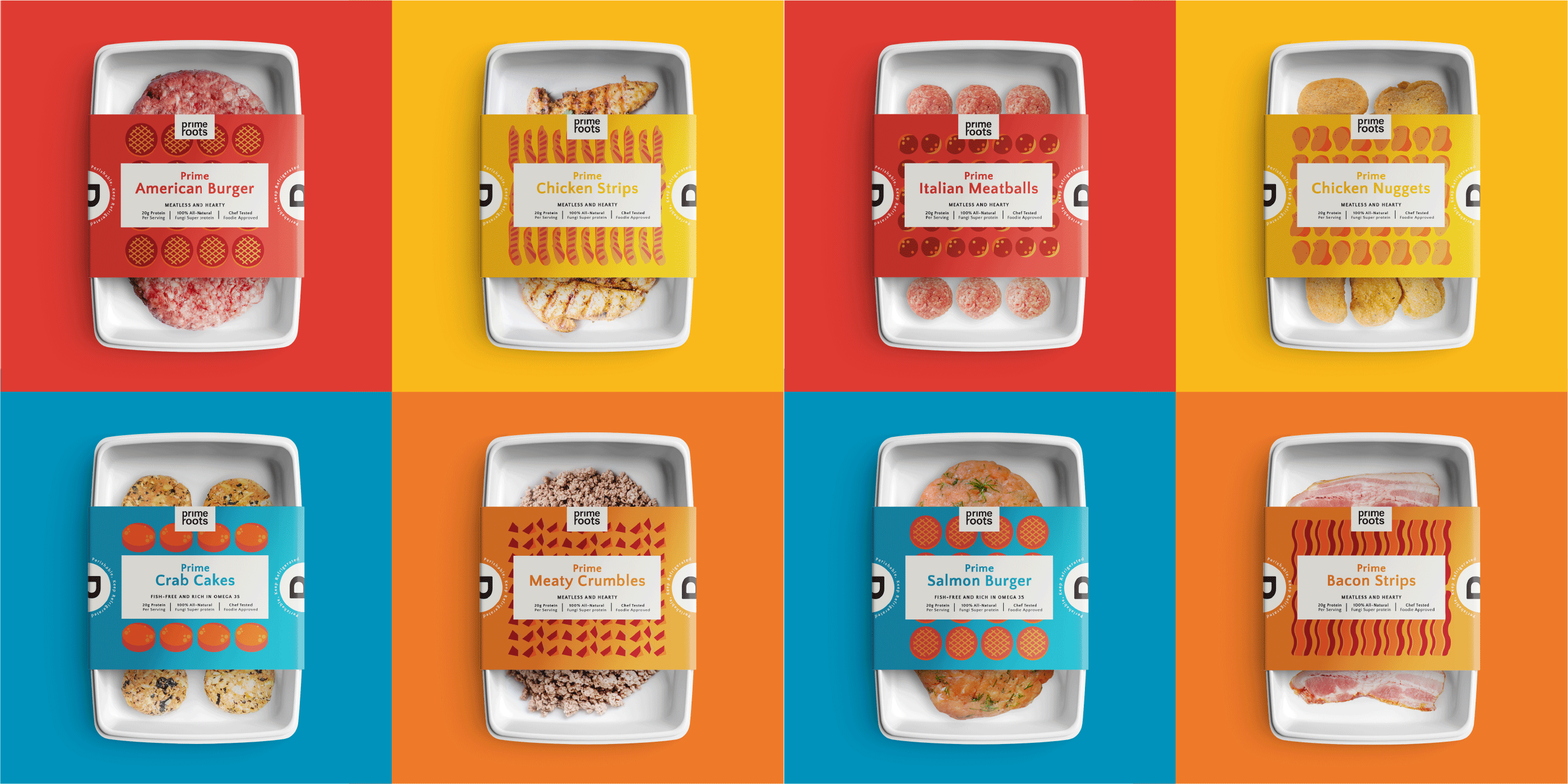
By using our color pattern to create 4 different product line. Red represents alternative beef, blue represents alternative seafood, yellow represents alternative chicken and orange represents alternative pork product line. Also creates the meat pattern to make the packaging more refreshing and playful.


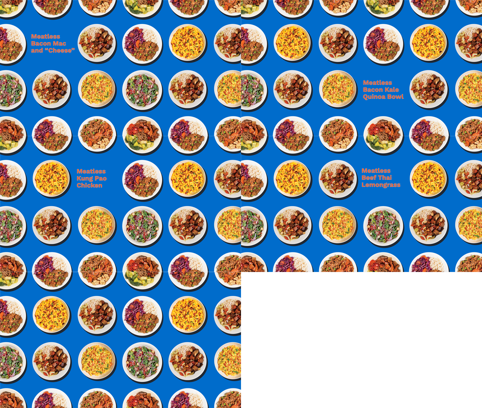
Prime Roots’ Ready-to-eat Meals Packaging


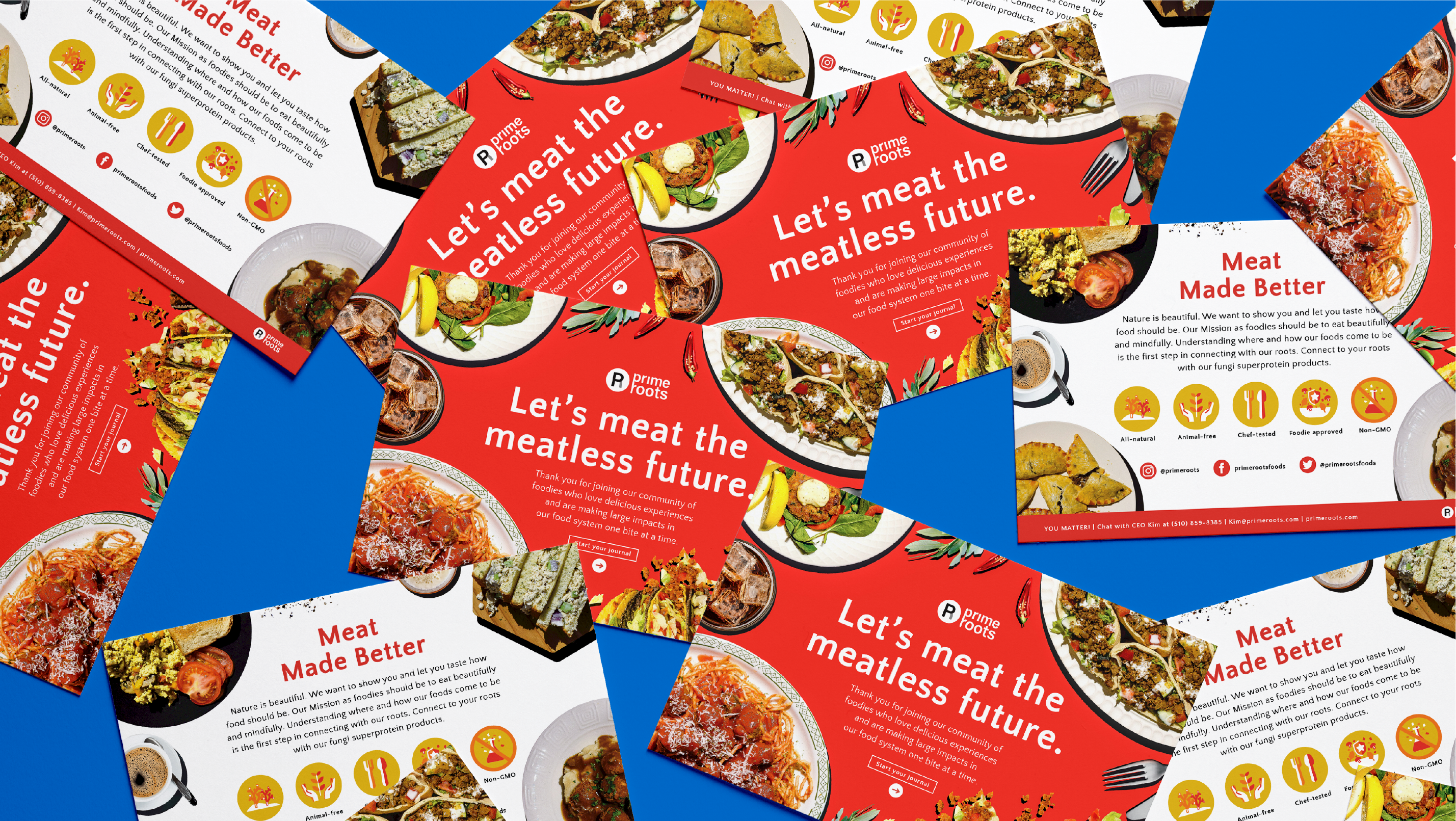
The Thank You Card
Thank you for joining our community of foodies who love delicious experiences and are craving change in our food system to be truly sustainable.
Tell friends, family and everyone on the internet about us.
We’ll be launching our products in a few months and as one of our “superfoodies” we would love for you to help us test our products and come to our invite-only events.
Be sure to follow us on social media Instagram @primeroots, and join our members only Facebook Group to see delicious photos and recipes from fellow community members, and Twitter and Facebook.


